Since we've hit the first Sears on W. Main St., and its modernist replacement, I'm going back to the second Sears to talk about its soon-to-come modernist replacement. I profiled the Sears building back in August when I examined the intersection of Dillard and Main.
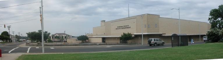
It is currently the Durham County Health Department
(Looking south)
I've been trying to get my hands on the site plans for the new human services complex, set to replace this building, as well as it's parking, which is set to replace the 4-5 historic structures across Dillard Street. I've gotten the run-around on the site plan, which should be public. And I'm sure it is - just not publicly public.
The current building doesn't particularly move me in the way most pre-1950s buildings do, While I try to see if I'm falling into the trap of previous generations - advocating the demolition of things that have gone out of style, it's hard to find a lot of architecturally redeeming qualities about the Sears building.
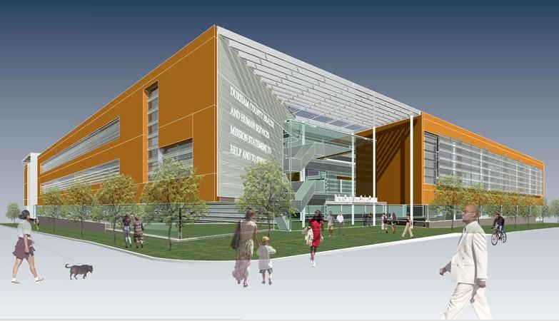
I did find the rendering of the new human services complex on the architect's website, though. Unfortuately, I don't find a lot of architecturally redeeming qualities about it, either
(Freelon Architects)
I suppose it has a front entrance on Main St., but, despite scattering a bunch of distracting avatars around the picture, this building doesn't look very friendly. It looks like another piece of sculpturesque inhuman modernism - that says "I'm supposed to be impressive" a bit too loudly, and doesn't pull it off.
A few issues:
1) Isn't this a corner site? Why doesn't this building respect the corner? I don't have a site plan, so I don't know if they've set the building back on the site, which would be a mistake.
2) Is 1/2 the facade and all of the side wall basically blank? Message to the passerby - you are not welcome here.
3) This building borders a historic district - why (and this is problem with many renderings) doesn't this show the building in context - whether all of these jaunty angles and asymmetry function or don't function in the context of other buildings will have a lot to do with how bad or decent it looks.
4) The question I always ask myself about new architecture is - how will it look in 5-15 years? Once all gleam has worn off and the glass is scratched up? Will it age gracefully, or just be cheap and dingy looking? Many modernist structures, particularly the government ones, are not looking good. Turns out prefab concrete doesn't age well.
5) Is it really orange?
Unfortunately, the county has likely hired this firm to build a human services complex, not to build an anchor building to connect the HOPE VI and Golden Belt developments with the east side of downtown. I suspect that the county has a very narrow focus here, which, they might argue, doesn't include city-making. Perhaps they would argue that that is outside of their purvey, but the choices they make - to demolish an entire block of historic structures, to build a building like this, to, potentially, move the library, do not occur in a vacuum.
Since they've tossed the dowtown Master Plan out the window with their plans for three blocks of East Main - what is the county's new vision for the east side of town? Just "government services" that leave this a scary desolate place at night and on the weekends? Any chance that this side of town will still become a mixed-use, infilled area with retail uses along Main Street, as per the master plan?
I'm not at all against the Human Services Complex being built at this location. But I am against tunnel vision. This is a big project that will have a profound effect on the surrounding environment on the east side of downtown that they, and the city, should not ignore. Think big, and comprehensively.
Comments
Submitted by coco (not verified) on Wed, 10/25/2006 - 2:41am
Even though Orange is my favorite color, this rendering looks horrible. I totally agree that a building in the neighborhood with other historic structures should respect that character, instead of smacking with contrast. How odd to be opposite from the beautiful old church with a "modern" face. They should look at the downtown Marriott, and see how dingy that building looks all the time now. yuck.
where's joe?
Submitted by coco (not verified) on Wed, 10/25/2006 - 2:42am
one more thing- this architectural rendering was made to celebrate Halloween: ghosts in front of a pumpkin building.
Submitted by Michael (not verified) on Wed, 10/25/2006 - 5:40pm
You obviously know a lot more about the state of the planning stages for this building than I do. Could you fill me in (here or privately -- e-mail link on my blog) on the current state of planning and where you found out about it?
If we work together, we might be able to make enough noise to change this. I honestly had no idea there was a plan to level the old Sears and put up a building this big -- I thought it was a renovation of the old Sears. (I guess this is what happens when you spend two years studying urban geography in the abstract -- you have no idea what's actually going on in the real world.)
Add new comment
Log in or register to post comments.